Eu24 Web
Header
Description
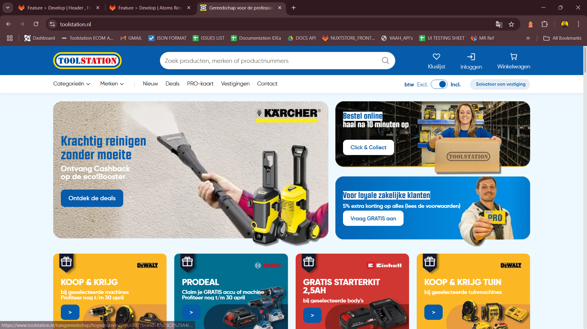
The Header provides a global navigation bar with brand identity, category navigation,
search, user actions, and utility options like branch switcher, cart, and auth.
Built using Nuxt 3, Composition API, TypeScript, TailwindCSS, and Pinia.
It’s fully responsive, adapting seamlessly to mobile and desktop layouts.
Supports internationalization with dynamic language switching via useI18n.
Purpose
Display persistent access to navigation features like categories, user account, cart, language, and search. Allow users to toggle between branches and VAT views. Provide brand visibility and utility access from anywhere in the app. Dynamically fetch and render navigation data from Builder.io CMS.
Use Cases
- View and interact with:
- Brand Logo
- Search AutoComplete
- Save List
- Auth/Login section
- Cart preview
- Mobile hamburger menu (on small screens)
- Category Dropdown
- Branch Selector
- VAT Toggle Switch
- Dynamically show or hide elements based on screen size (
isMobile) and locale (useI18n). - Auto-collapse the category dropdown on route change using
router.beforeEach.
Expectations
- Fully responsive layout using utility-first Tailwind classes.
- Async loading of components for optimized performance.
- Fetch header menu links dynamically from Builder.io with
getHeaderMenu(). - Tracks locale changes for dynamic content updates.
- Handles per-locale SEO attributes via
useHead()anduseLocaleHead().
Developer Strategies
- Use
defineAsyncComponentto dynamically import all major header sections for better performance. - Use
useDevice()to detect mobile devices and render components conditionally (e.g., MobileHamburger). - Initialize i18n-based SEO and language settings in
useHead(). - Load header menu links using a composable that hits Builder.io CMS (
getHeaderMenu()). - Collapse mobile menus on route change via
router.beforeEach.
TODOs for Developer
- Improve accessibility: ARIA labels, keyboard navigation for dropdowns.
- Add loading and error states for header menu data.
- Add animation/suspense for async components.
- Write unit tests for:
- Mobile vs desktop variant rendering
- Dynamic component mounting
- Header link data fetching
- Add analytics tracking:
- Header search usage
- Cart icon clicks
- Auth login events
Components Used
Component | Description
| Action | Endpoint |
|---|---|
| TsNuxtCard | Main container card with border and padding styling |
| TsRow / TsColumn | Grid layout for user info and buttons |
| TsTypography | Text rendering with responsive variants |
| TsButton | Action buttons (e.g., Show Card, Edit Profile) |
| TsTag | Status labels like "Pro Card-lid" |
| TsDivider | Section divider |
| TsContent | Dynamic content loader (for banners) |
| TsCarouselCardProduct | Product recommendation carousel |
| NuxtLinkWithLocale | Internationalized router links |
| TsIcon | Icon rendering in buttons and labels |
Flow Summary
Mount Phase
- Detect locale and set SEO meta tags dynamically using useI18n() and useLocaleHead().
- Fetch header navigation links from Builder.io CMS using getHeaderMenu(locale, apiKey):
rootStore.header_links = await getHeaderMenu(locale.value, builderApiKey, nuxtApp);
- Track screen size with
useDevice()to show/hide mobile-specific components likeMobileHamburger.
Routing Behavior
- Automatically collapse the category dropdown whenever a route change occurs:
router.beforeEach(() => {
  menuStore.show_category_dropdown = false;
});
Layout Features
- Top Bar: Brand logo, search, save list, auth section, cart, mobile menu.
- Bottom Bar: Category dropdown, VAT switch, branch selector.
- Ribbon: Optional content bar (e.g., for announcements or deals).