

Ribbon
Ribbon section model is used to display the ribbon component on the page.
Ribbon
Ribbon section model is used to display the ribbon component on the page.
Opening the entry on builder
To open the entry on builder, select the section model on the left side bar & search for the ribbon section model.
On the ribbon section model, you can see the Main entry, it is the default entry which is used to display the ribbon component on the page. If we have any specific ribbon entry for the page then it will be overridden by the main entry.
Create a new ribbon entry
To create a new ribbon entry,
- Click on the
+ New Entrybutton on the ribbon section model. - Give the name to the entry.
- Click on the
Targetingicon.
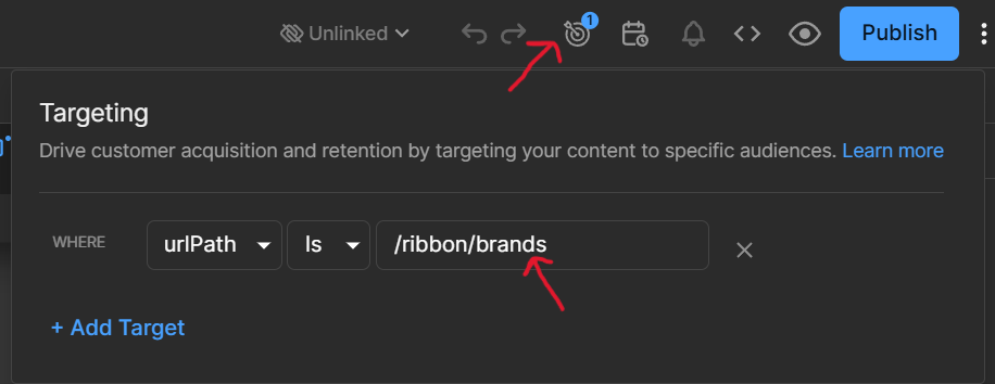
- Select the type
urlPath& give the unique path name forward by the/ribbonprefix, eg./ribbon/brands. - Click on the
Savebutton.
Note: The path should be unique & should not be used by any other entry.
Targeting the entry to the page
we are using regular expression to target the entry to the page.
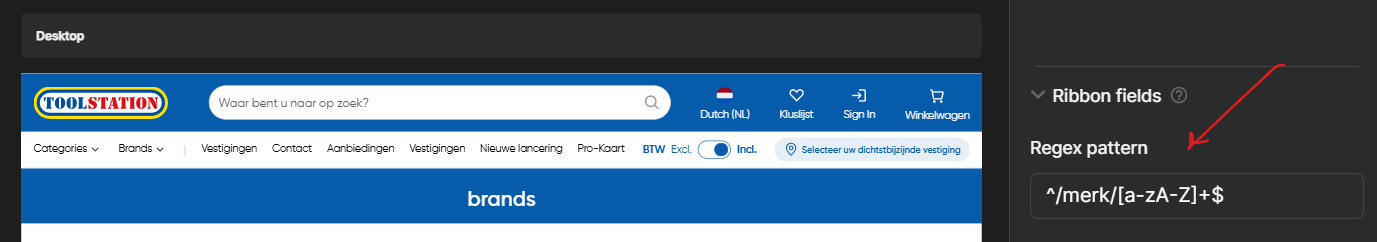
To target the entry to the page, we have set the Regex Pattern property with the page url regex pattern.
eg: if the page url is https://www.example.com/merk/[slug] then the regex pattern will be ^/merk/[a-zA-Z]+$.
RibbonBanner Component
The ribbon banner component is used to display the ribbon component on the page.
It is a dynamic component which takes data as a list type prop.
Note: The data prop is restricted to 3 items only to keep the ribbon banner responsive.
Props
| Name | Type | Default | Description |
|---|---|---|---|
| bgColor | color | "" | Background color of the ribbon banner. |
| fontColor | enum | "" | Font color of the ribbon banner. |
| customFontColor | color | "" | Custom font color of the ribbon banner. |
| data | any[] | "" | Data to be displayed on the ribbon banner. |